A Smarter Way To Choose Your Next Meal

DinerFinder is a conceptual food delivery aggregator designed to help users quickly compare options across multiple food delivery services such as prices, delivery times, and restaurant availability in one seamless platform. As a UX researcher, I led the research to uncover motivations, pain points, and decision-making patterns to inform this solution. 

UX Research Lead

May – July 2025

The primary research objectives were to understand the goals, behaviours, and contexts of people who use food delivery apps, and to explore their experiences, preferences, and frustrations. Insights from this research informs the design of the DinerFinder platform. The five research questions guiding the study included:

To answer the research questions, I conducted three (3) user interviews, and three (3) usability tests

Preliminary Work

Users were selected based on a pre-defined profile; mainly professionals who lives in an urban or suburban area, are comfortable using technology, uses food delivery apps at least 2 times per week, and have used more than one food delivery app overtime.

Interview and Test Setting

All three sessions were done virtually via Zoom and were recorded. Participants were sent an email in advance to prepare them on what to expect and to minimise any technical difficulties during the session.

Session Breakdown

Each session was approximately 60 minutes and divided into the introduction, interview and usability testing.

  • Introduction

    The introduction explained project goals and objectives, session flow and what is expected of them in the usability testing session.

  • Interview

    The interview uncovered participants’ habits and motivations, decision-making factors, features use and expectations, frustrations, personalisation expectations and comparison behaviours.

  • Usability Testing

    The usability testing was done using the Caviar desktop app to observe key UX breakdowns and behaviours. Users were given 3 tasks to perform:

While usability testing focused on a single food delivery app (Caviar), users consistently compared their experience to other platforms like Uber Eats, Skip the Dishes and DoorDash. This natural cross-platform thinking reinforced the need for a comparison tool, validating the aggregator concept.

Analysis

Using Dovetail and Miro, I synthesized data from the interviews and usability testing sessions to uncover patterns, challenges, and opportunities in how people discover and choose restaurants. These insights would guide the design decisions behind DinerFinder, helping to create a more intuitive and user-centred experience.

Research Synthesis

To make sense of the interview and usability testing data, I transcribed and coded responses in Dovetail.

This helped me spot recurring user needs and frustrations, giving a clear foundation for deeper analysis.

Research Synthesis in Dovetail
Affinity Mapping

By clustering related insights, in Miro, I uncovered consistent pain points and opportunities such as: misleading and incomplete filters, misleading menu categorisation and organisation, and difficulty finding dining options that fit dietary needs. 

These clusters highlighted the most pressing challenges users faced, and opportunities for design improvements.

Affinity Mapping in Miro
User Persona

I developed a persona to embody the primary user; the Convenience Deal Seeker; a busy young professional who wants to quickly find affordable and reliable dining options tailored to preferences. 

This persona can be used to later guide design choices by keeping those involved aligned on user priorities.

User Persona: Convenience Deal Seeker
User Journey

I developed a user journey map to illustrate the end-to-end dining decision process. 

Pain points emerged at three stages: when comparing dining options, when customising orders, and post ordering support.

User Journey when placing a food order

Findings

Below are the five (5) themes I found from the affinity mapping and some quotes that support these themes

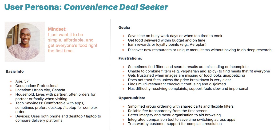
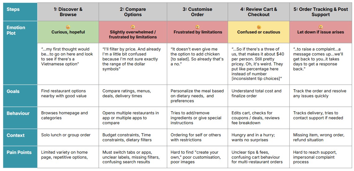
Cost, value perception, and convenience mainly drive loyalty and app switching

Users choose food delivery apps based on a mix of price, deals, ratings, and restaurant availability, often switching platforms for better value, clearer loyalty perks, and fresh, high-rated recommendations.

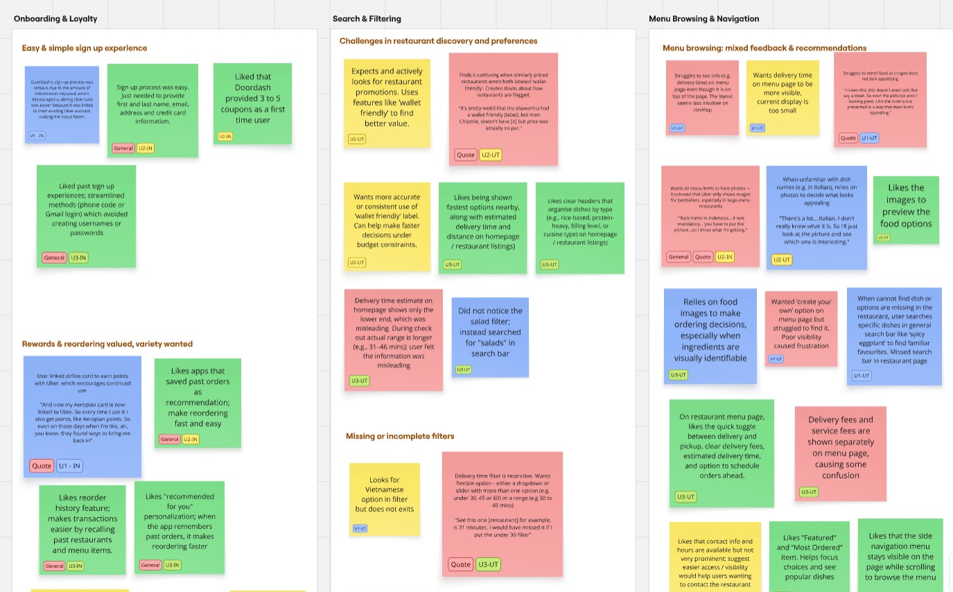
Poor filters, navigation and layout undermines trust and decision making

Users value clear layouts, proximity-based listings, appealing food photos, and easy-to-use categories.

Users are frustrated by limited and unclear filters, inflexible customisation, cluttered menus, and inaccurate categorisation that makes meal selection harder.

Group ordering is high priority but sometimes poorly supported

“...If there's like a group order so everyone can choose from their own phone...I can share a link...with the same shopping cart... It's gonna be in one transaction."

Unclear cart and fees can lead to drop off

Users expect clear, flexible cart management with transparent pricing. Confusion arises when customised orders must be deleted and re-added.

Multi-restaurant checkout flows also lack guidance, and tip/tax/fee labels are not clearly explained.

Customer support is a weak link

Users value accurate order tracking but feel frustrated by limited control over cancellations and an impersonal, unclear complaint process.

Lack of progress tracking, slow follow-up, and the absence of in-app support reduce trust. Refunds alone do not always resolve dissatisfaction.

Based on the insights, I proposed an aggregator platform that:

There is a clear appetite for a more streamlined way to compare food delivery apps.
"If I had some sort of tool that could place the two websites side by side...list them in column format so you can actually compare the prices...how long the food would take, and maybe the star rating of the restaurants, that would be probably a very useful tool to be able to compare."
Interviewee

Key next steps following this research for the food aggregator app includes:

Working on DinerFinder taught me how subtle decisions can shape user behaviour and decision making across multiple platforms. I realised that recruiting the right participants is critical; insights are only as strong as the users behind them. 

Translating research into actionable guidance required not just observation, but structured synthesis. Coding sessions in Dovetail and organising themes through affinity mapping in Miro helped reveal patterns in behaviours, pain points, and priorities that are not immediately obvious.

Building personas and a customer journey made me appreciate the role of storytelling in UX research; how individual frustrations and motivations connect to broader workflows and product experiences.

Overall, this project strengthened my confidence in turning research into actionable design opportunities and taught me that effective UX research requires empathy, rigour, and narrative thinking to truly inform solutions that resonate with users.